ZestZen
CONCEPT CASE STUDYA brighter moment in your day.
01 / The brief
Give a fictional sparkling-water brand an energetic identity that stands apart in both chilled retail and social feeds.
02 / The audience
Adults who enjoy distinctive non-alcoholic drinks and visually expressive lifestyle brands.
03 / The design challenge
Communicate refreshment quickly without making unsupported stress-relief or health promises.
04 / The concept process
- Define the drinking occasion and refreshment message.
- Establish colour roles and a legible can hierarchy.
- Explore product photography with a restrained citrus set.
- Map the direction to launch, flavour and serving-occasion social content.
05 / The creative decisions
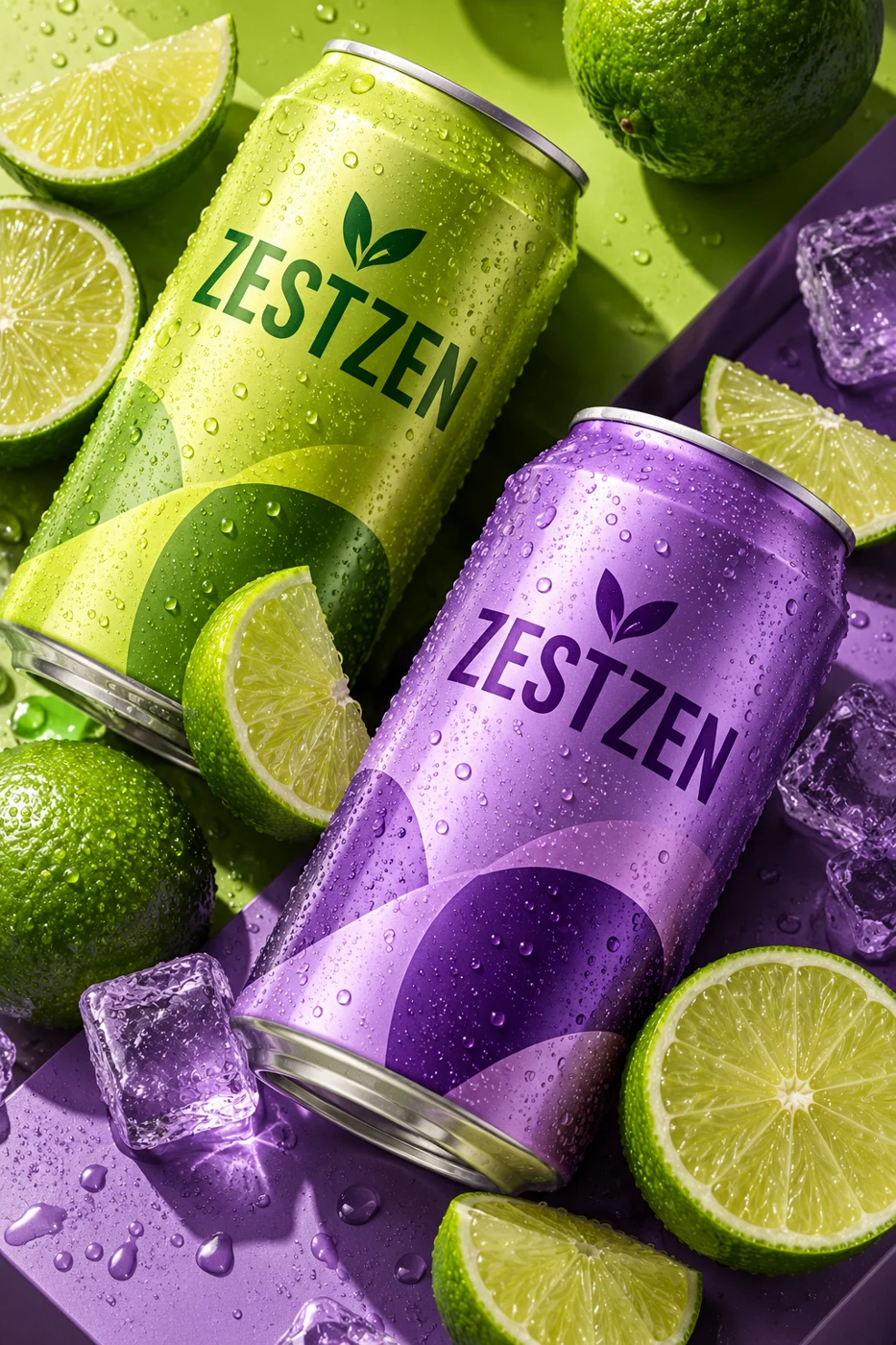
Chartreuse and violet form a high-contrast system. Large naming on the can creates a repeatable recognition cue; citrus styling communicates the proposed flavour direction. Short campaign lines leave room for the product image.
06 / The design outcome
A distinctive can-and-campaign concept demonstrates how packaging and social art direction can share one visual language. No beverage formulation has been developed.
07 / Validation & next steps
Review ingredient and label requirements before production, then test flavour comprehension, shelf recognition and small-screen readability.
This concept has not been launched or measured with customers. No sales, conversion or engagement results are claimed. The outcome shown is a visual design study.