BrewBound
CONCEPT CASE STUDYGood coffee. Going places.
01 / The brief
Make a ready-to-drink coffee brand recognisable on the shelf and in a busy social feed.
02 / The audience
Young professionals and creatives looking for convenient coffee.
03 / The design challenge
Balance a premium product impression with the informality of an everyday drink.
04 / The concept process
- Define the audience and daily-use occasion.
- Set a cream, espresso and orange visual system.
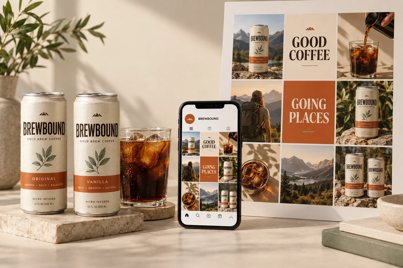
- Explore can packaging alongside a nine-tile social presentation.
- Review colour repetition and recognition across physical and digital views.
05 / The creative decisions
A compact wordmark, espresso typography and a cream base give the can a clear hierarchy. Burnt orange creates a campaign accent that carries into short social statements.
06 / The design outcome
A coordinated packaging and social presentation demonstrates one identity across two touchpoints.
07 / Validation & next steps
Test brand recognition, mobile readability and the clarity of the purchase action before a live launch.
This concept has not been launched or measured with customers. No sales, conversion or engagement results are claimed. The outcome shown is a visual design study.